Project Summary
- Designed mobile app onboarding flow and prototype
- Created engaging illustrations to enhance visual experience
- Redesigned website homepage for improved user flow
- Partnered with client to boost website engagement
- Ensured all designs aligned with existing branding and color system
Tools Used
Onboarding Survey
Goal
Create a quick, welcoming user survey to set up the user with a realistic and helpful health plan.
Maintain brand guidelines for text and colors.
Solution
A quick survey that presents one question at a time to keep it simple and stress-free.
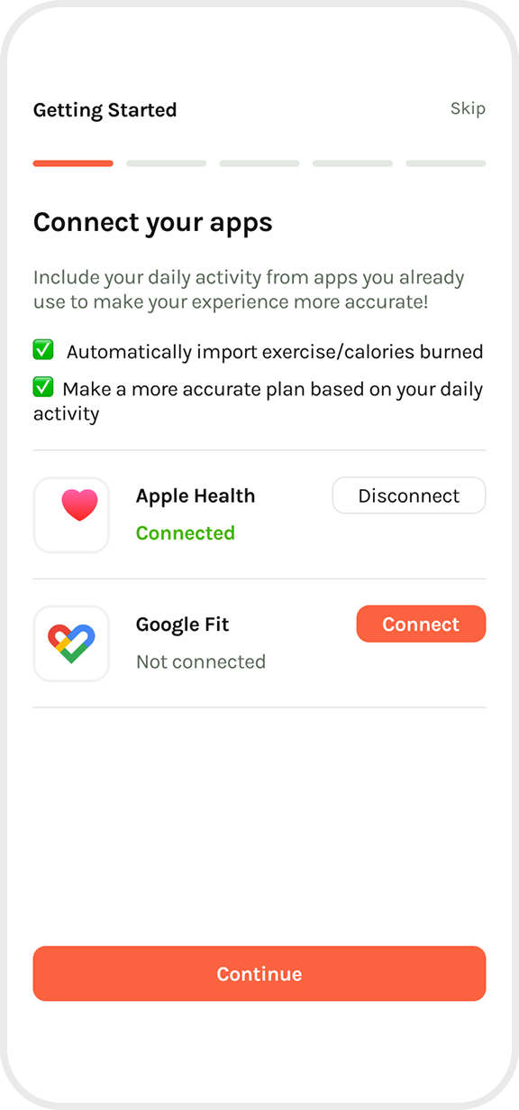
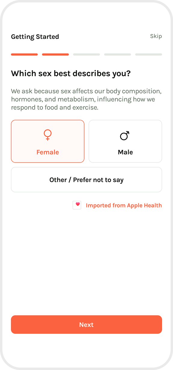
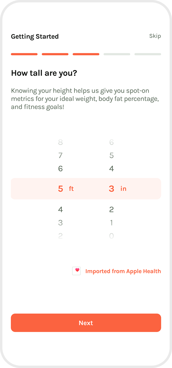
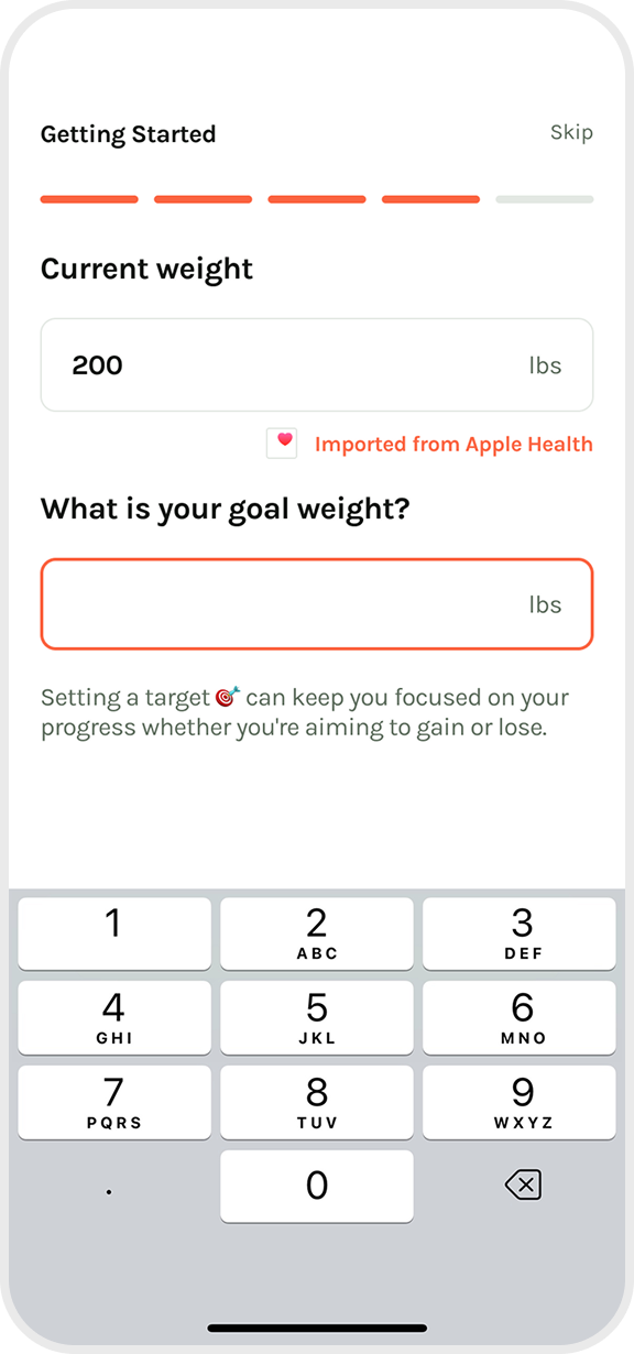
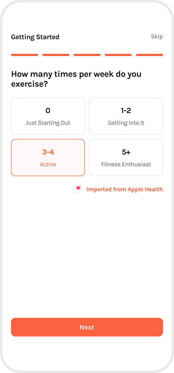
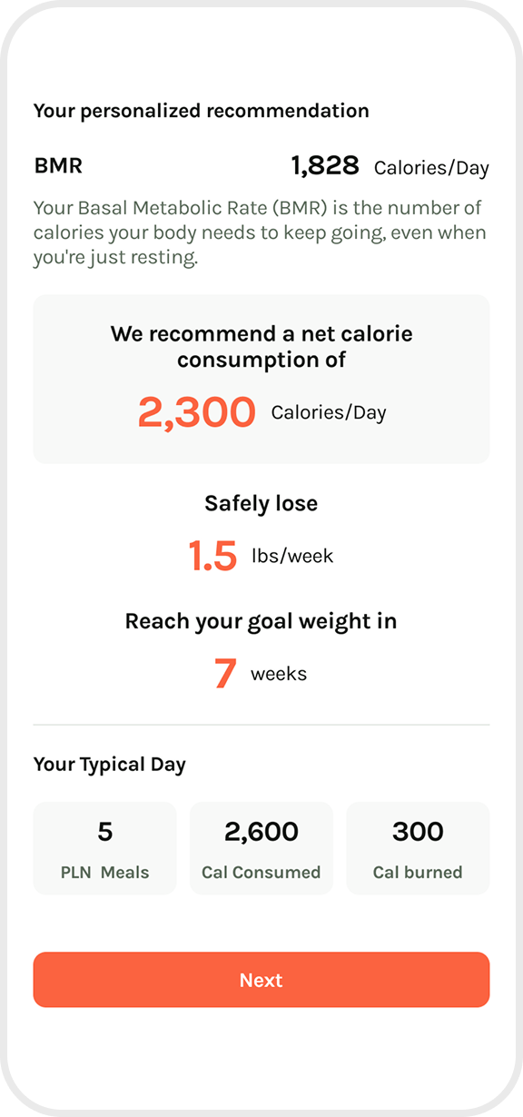
I used white backgrounds and a limited color palette with simple, minimalist imagery to keep the experience clear and uncluttered. The progress bar reassures users that the survey isn’t too long and keeps them motivated as they move forward.
Since the questions are personal, I’ve used encouraging language and clear explanations to help users feel comfortable, confident, and in control.
Mobile App Launch Screen
Goal
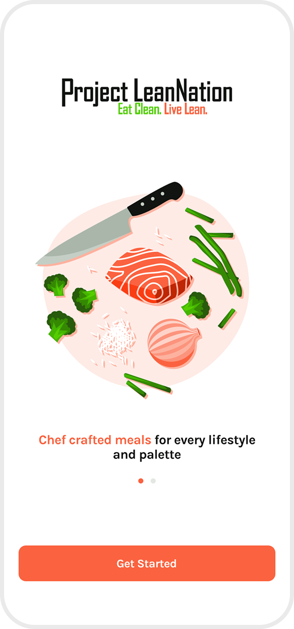
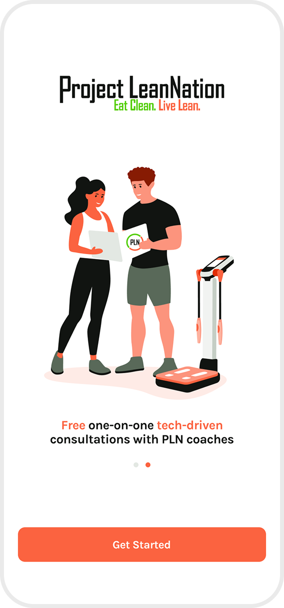
Create warm, welcoming illustrations while maintaining a strict color palette. Illustrations for use on the app’s sign up/log in screen, along with branded interface leading users to create their account.
Solution
Stylized illustrations representing key factors in the offerings of the business: 1-on-1 consultations and meal plans with healthy, balanced selections.
Colors

Above is the complete set of colors available for all illustration.
Using a specific color set keeps illustrations consistent, recognizable, and on-brand, making them more memorable and impactful.
In App Permissions
Goal
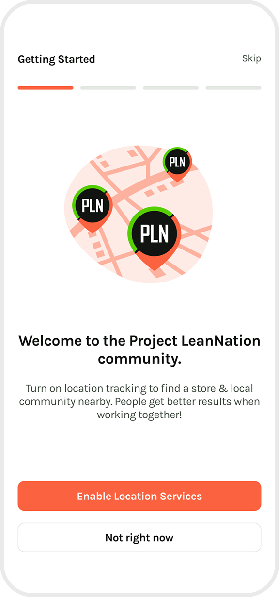
Create fun, simple illustrations to bring visual appeal and interest to screens prompting the user to expand the app’s permissions.
Solution
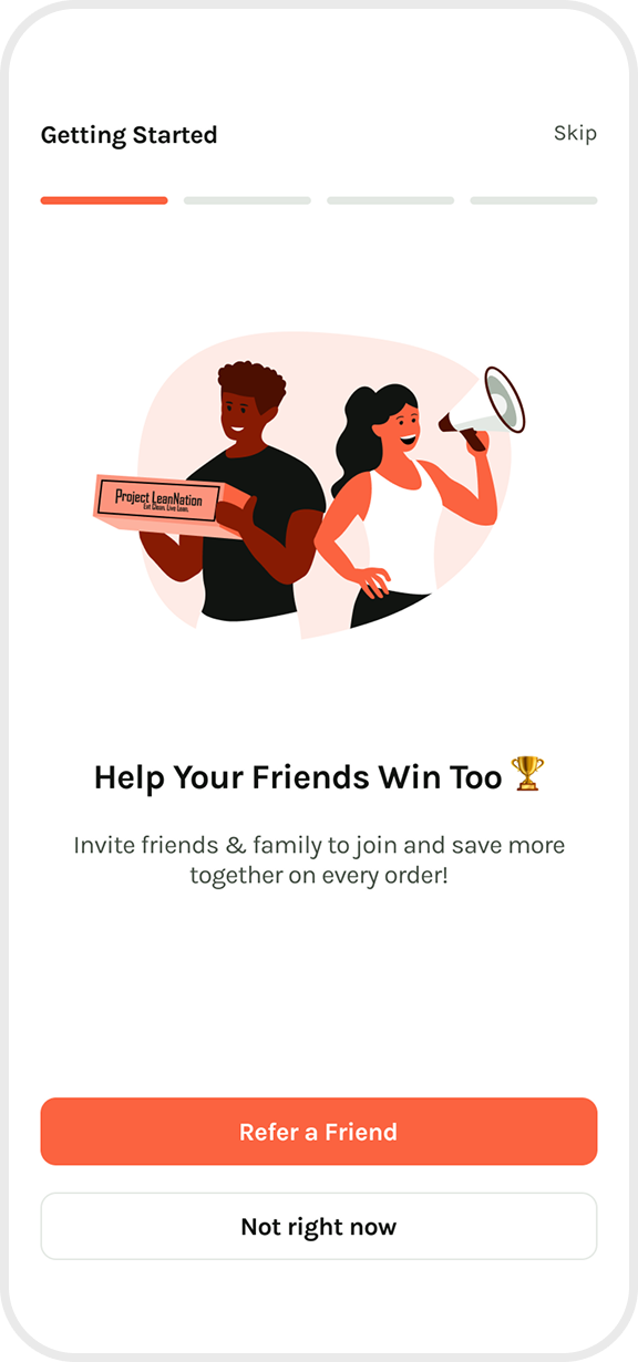
Fun, stylized illustrations, maintaining the tone and style set previously. These are paired motivational CTAs (Call-to-actions) with distinct tones and purposes.
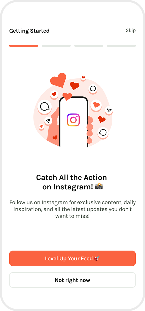
By writing a caption like “Catch All the Action on Instagram! 📸” I have included a FOMO-driven CTA (call-to-action) that builds excitement and urgency, ideal for boosting social media engagement.
I have captioned the referral screen “Help Your Friends Win Too 🏆” because this is a motivational CTA that encourages generosity and shared success, perfect for referrals or promotions benefiting both users and their friends.
👍 ❤️ 🎉 🔥 🚀 Emojis add friendliness, appeal, and have proven to boost conversion rates within this brand.
Let's be friends!

